Benjamin Sutton, Hyperallergic, December 3, 2014
MIAMI BEACH — The Untitled art fair may take place in a stark white tent with a hot pink slice cut into it, but the work inside is every color of the rainbow. In fact, “rainbow” is the most common palette at the fair this year: every other booth seems to feature at least one work in which yellow shifts to red, purple, blue, green, and back. This color wheel aesthetic compliments the gaudy beachwear favored by so many Miamians nicely, and contrasts pleasantly with the staid black-and-white color scheme that is almost as prevalent at the fair.
The fair’s most conspicuous selfie bait is Phillip K. Smith III‘s enormous “Bent Parallel” (2014), a V-shaped sculpture with welcoming, wide-open panes of mirrored glass concealing lights that slowly shift between pink, red, blue, and green. The work melds the glass-and-steel aesthetic of modern architecture, the perfectly reflective surfaces of Finish Fetish art, and the color palette of Light and Space artists like James Turrell. Few visitors passing the Royale Projects booth could keep themselves from stopping to pose for an #artselfie.
Sited in one of the long wedges between the not-quite-parallel rows of booths at Untitled, Guillermo Mora‘s “cr_O_ma” (2013) is part of the fair’s “Projects” program of large-scale works installed in the halls. Though it resembles an Ikea assembly project gone terribly awry, it merits walking around to get the full effect of the shifting colors and jumbled wooden limbs.
Dennis Loesch’s “Gradient Type II” (2013), in the booth of Berlin’s Dittrich & Schlechtriem, looks like what Mora’s “cr_O_ma” would be if the art handlers had followed the instructions. Its aluminum beams similarly reward viewing from different angles as you move past the piece.
Jen Stark, the Bridget Riley of gradient art, has two kaleidoscopic cut-paper sculptures on view in the Eric Firestone Gallery booth. “Gradient” (2014) in particular showcases her skill at crafting vibrant and eye-popping works using very simple means.
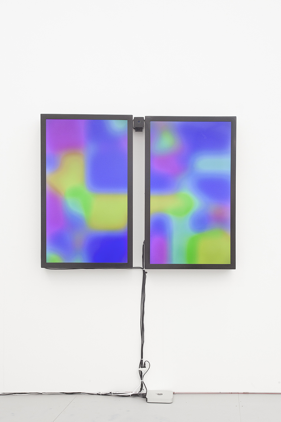
By far the most intriguing work in Steve Turner Contemporary‘s booth — Yung Jake’s twisted renderings of Fiji water and Grey Goose vodka bottles just weren’t doing it for me — is Jonas Lund‘s “VIP (Viewer Improved Painting),” whose two large monitors display a field of abstract color gradients that shifts according to fair-goers’ movements around the piece. It provides the interactive component nobody knew Cory Arcangel’s “Photoshop Gradient Demonstrations” needed.
The booth of London’s Vigo Gallery features gradients almost exclusively. But whereas Oliver Marsden’s “Fade” paintings are intensely underwhelming, Kadar Brock‘s abstract composition of pink, mauve, and blue is a real sensory treat with its archipelago of holes.
As if to bring the gradient theme full circle, one of my last stops at Untitled was the booth of Montreal’s Galerie Antoine Ertaskiran, which has a solo presentation by the Italian artist Andreas Sala. Like Phillip K. Smith III’s sleek selfie mirror, Sala’s latest series references modernist architecture, but with drastically different results. His metal sculptures are all based on one of Ludwig Mies van der Rohe’s earliest projects, a design for a studio apartment. With its gradient of oxidized steel, the diptych “Tutto Tropicale” contrasts sharply with the artist’s other monochrome works nearby. It proves, perhaps more convincingly than any of the other gradient works at this year’s Untitled, that a rainbow palette and conceptual rigor are not mutually exclusive.

